Behind the scenes: Creating a logo
How a simple task spiralled (featuring brain plants, pen vaginas and too many Canva templates)
Welcome to Life after Trauma; I’m Clare Egan. This edition is about my attempt to capture the conversations we have here in a single visual. This piece is full of images. Please click through to see the true extent of my brain’s meltdown. 😉
Could I capture the spirit of Life after Trauma in a single image? That was my goal when I sat down to make a logo a few weekends ago. As will become clear, I am not a designer. I have never been trained in graphic design nor in any of the tools they use. But I do have a strong visual sense. I know what I like, and maybe more importantly, what I don’t like.
My Substack income is still very small, so I knew I’d have to do it myself. I was willing to use AI to generate ideas, but felt strongly that I wanted to make the final image myself, even if I started from a template. Using Canva, I’d already made a simple logo for my Survivors on Screen series and I felt confident that I could cobble something credible together. Reader: I WAS WRONG!
What follows is an illustrated tour through my brain as it hopped from one idea to the next, spitballing and iterating with no-one to reign in even the craziest creative impulses. (What if I put red hair on the compass?!)
But, it was fun! It also helped me to think through our community’s mission in a different way. I’d love to be sharing a slick new brand identity with you today, but maybe this tour of my chaotic mind will be more fun to read.
The inspiration & brief
The project started well. I made a Pinterest board of things that resonated with the themes we talk about here:


I put together a design brief. If I had the money to hire a designer, how would I describe this project to them?
It read:
I’d like to create a logo for a newsletter focused on building community among survivors of trauma. The space is optimistic, forward-looking, hopeful, proactive and continuously evolving.
The colour palate includes rich, saturated colours like navy blue, forest green, mustard yellow and burgundy. The accent colour is white.
I would like a logo that is rooted in nature and its continuous evolution but also nods toward my work producing essays, podcasts and videos to support survivors.
I should feel grounded and honest. I’ve mentioned the phrase ‘sunlight as disinfectant’ before; it’s a line from The West Wing which also calls to mind the power of talking about horrible things in order to make them more survivable.
The logo should have a handmade feel, but not be cheap or shoddy. (Ironic because of course I was too cheap to pay for it!)
The brainstorm
I thought about some potential concepts:
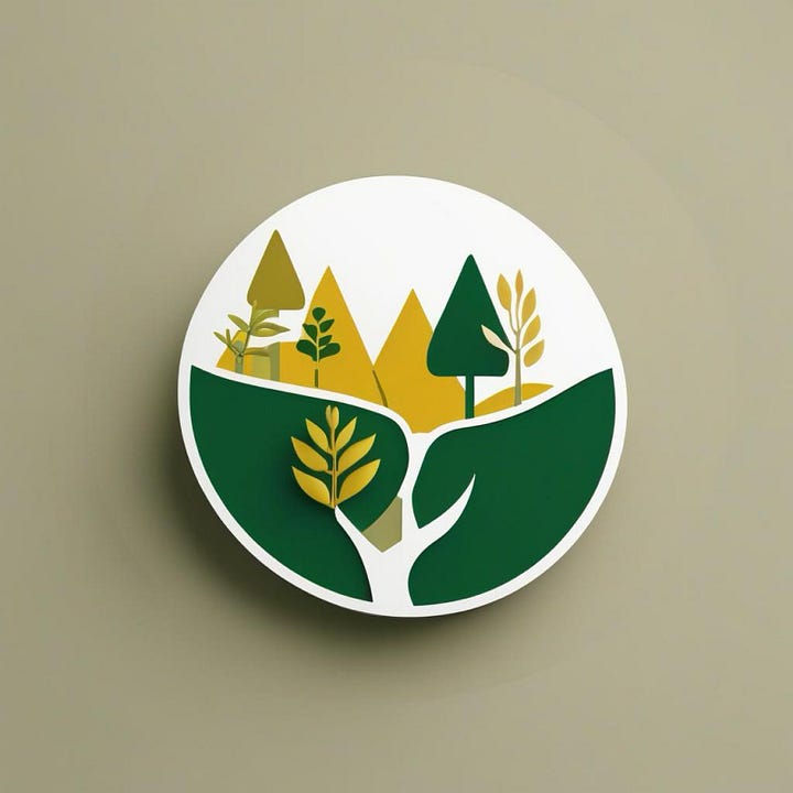
Nature imagery. Perhaps a plant that’s just starting to take root? To me, feeling grounded is the opposite of feeling traumatised.
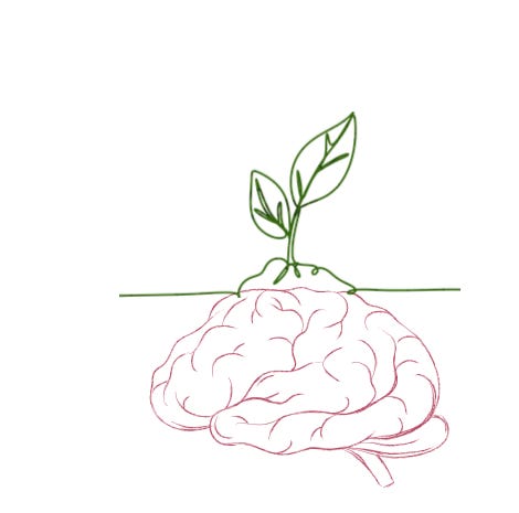
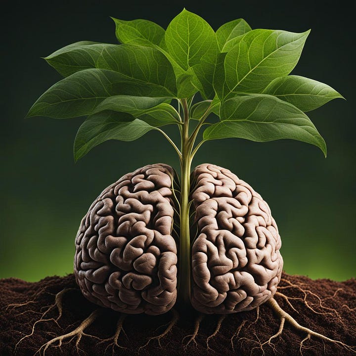
Something involving an image of the brain to show how trauma changes our neurological wiring. This change doesn’t have to be negative. It can be life-giving. (I meant this metaphorically, but it ended up getting very literal!)
I liked the idea of the word 'beyond' indicating somewhere over the horizon, somewhere farther than we can currently see.
Maybe an image of a compass to show how Life after Trauma helps us navigate through unchartered territory. Compasses rely on the earth’s magnetic field to function, so this ties back to the first idea of feeling grounded.
I like the idea of having a person in the logo - maybe it’s a redhead (me!) writing or maybe it’s a genderless creature looking toward the future/horizon.
Maybe it captures what we do here: write essays, make podcasts, share stories.
I also had some things I didn’t want:
No imagery/symbols of women. Trauma impacts people of all genders
No rainbows or anything explicitly queer. I am queer, but this project isn’t centred on that aspect of my identity.
Nothing that, at a gut level, felt ugh
Nothing too depressing or morose. This space is about the aftermath of trauma, not the trauma itself.
Looking back, I wonder if this is where I went wrong. I had so many ideas and didn’t stick with any concept long enough to refine it into something meaningful. Working on a computer, rather than by hand, was certainly part of the problem. Endlessly clicking and scrolling made me spin in circles, looking for something out there, rather than rooting down into the ideas I already had.
I tried using AI to generate ideas, but quickly abandoned it. It was clearly reproducing society’s biases about survivors and favoured cheesy subheadings like 'reclaiming resilience' or language about being a ‘warrior’. We don’t always have good language for talking about life after trauma. I use the term ‘recovery’, which I like because it captures the physical, mental, emotional and spiritual dimensions of rebuilding a life. But ‘recovery’ is commonly understood as applying to a person dealing with alcoholism or substance abuse. Others like the term ‘healing’ which is much too soft and nebulous for me. Throughout this process, I longed for a single concept or idea that would visually express what it’s like to rebuild your life. But that doesn’t exist yet!
Anyway, enough chatter. Let’s have a look at some examples.


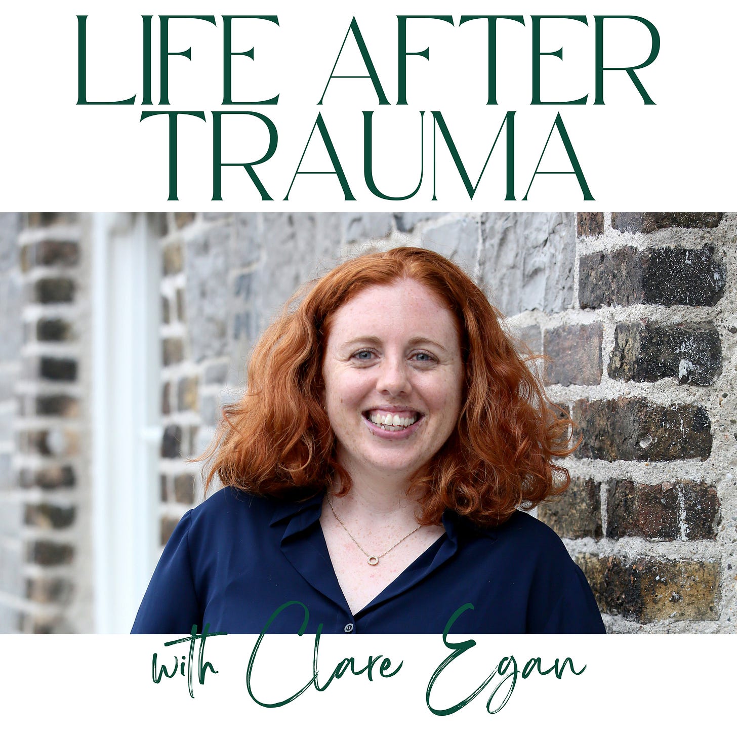
In the end, I decided to abandon (or at least pause) my attempts at visual wizardry. I customised a simple Canva template using a picture that feels like me and two fonts: a modern one and a paintbrushy, scripty one, that looks like a neater version of my handwriting.
For now, that’s all I need.
💕 If this piece resonated with you, please tap the heart below to help spread the word.
💬 In the comments, I’d love to hear your thoughts on my logo adventures. Are there any concepts that resonate with you, or any that you hate?


Clare, I don’t think there is any place in this you “went wrong”. Indeed, you’ve given us a marvelous look at your creative process, which apparently involves a lot of experimentation and investigation; openness. Often, “brainstorms” ARE stormy, not a serene progression from one step to another. And your outcome? I love the logo — it really does communicate YOU. Well done all around!
Except for the photo of yourself, I really liked the one with the red hair stuck on it. I found it visually striking, which made me want to read more... And talk about Canva! Everyone says it's so easy, and I've used it before, but I've wasted too much time on it recently trying to replicate another person's design, but with my info (her permission, nay command to do it). Tutorials ALWAYS assume a person knows more than I do about it. Kudos to you for your patience with it.